A complete redesign of a team management dashboard — rebuilt with real UX thinking, a full brand identity, and five fully functional screens.
A complete redesign of a team management dashboard — rebuilt with real UX thinking, a full brand identity, and five fully functional screens.
Brand Identity
Brand Identity
/
/
Visual Identity
Visual Identity
/
/
Logo & Branding
Logo & Branding

Bean Velvet is a coffee shop brand built around one idea: a cozy space with a personality of its own. Not a chain, not a concept — a place that feels like it was made by someone who genuinely loves coffee and wants you to feel at home the moment you walk in.
Bean Velvet is a coffee shop brand built around one idea: a cozy space with a personality of its own. Not a chain, not a concept — a place that feels like it was made by someone who genuinely loves coffee and wants you to feel at home the moment you walk in.


Process
Process
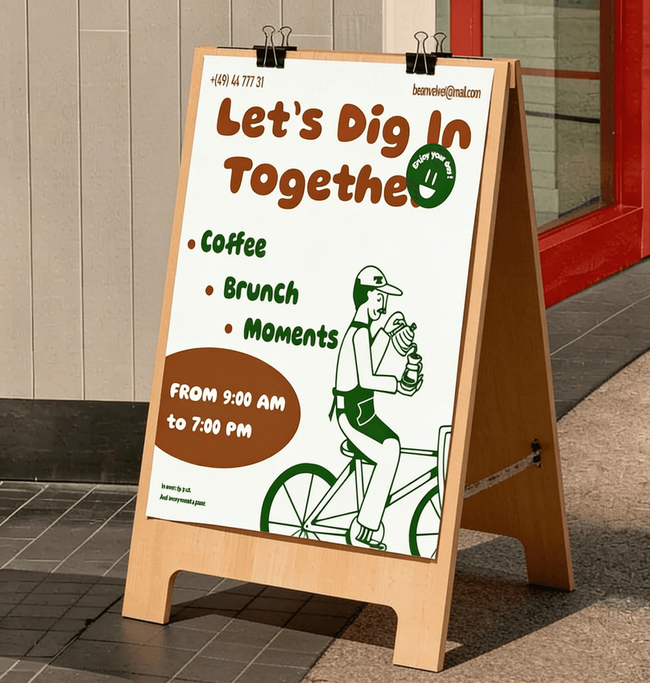
Started with defining the brand's personality — warm, characterful, and distinctly non-generic. From there, built the logo and color system around a deep forest green that felt premium without feeling cold. Developed the hand-drawn illustration style and brand character that became the emotional center of the identity. Extended everything across print collateral — menu, cup, coasters, loyalty cards — then art directed the final mockup presentation to show the brand living in the real world.
Started with defining the brand's personality — warm, characterful, and distinctly non-generic. From there, built the logo and color system around a deep forest green that felt premium without feeling cold. Developed the hand-drawn illustration style and brand character that became the emotional center of the identity. Extended everything across print collateral — menu, cup, coasters, loyalty cards — then art directed the final mockup presentation to show the brand living in the real world.
Started with defining the brand's personality — warm, characterful, and distinctly non-generic. From there, built the logo and color system around a deep forest green that felt premium without feeling cold. Developed the hand-drawn illustration style and brand character that became the emotional center of the identity. Extended everything across print collateral — menu, cup, coasters, loyalty cards — then art directed the final mockup presentation to show the brand living in the real world.
The Problem It Solves
The Problem It Solves
Most coffee brands either go full minimalist and feel cold, or go full rustic and feel generic. Bean Velvet needed a brand identity that felt warm and characterful without looking like every other indie coffee shop — something with a real personality you could put on a cup.
Most coffee brands either go full minimalist and feel cold, or go full rustic and feel generic. Bean Velvet needed a brand identity that felt warm and characterful without looking like every other indie coffee shop — something with a real personality you could put on a cup.
Most coffee brands either go full minimalist and feel cold, or go full rustic and feel generic. Bean Velvet needed a brand identity that felt warm and characterful without looking like every other indie coffee shop — something with a real personality you could put on a cup.


Brand identity
Brand identity
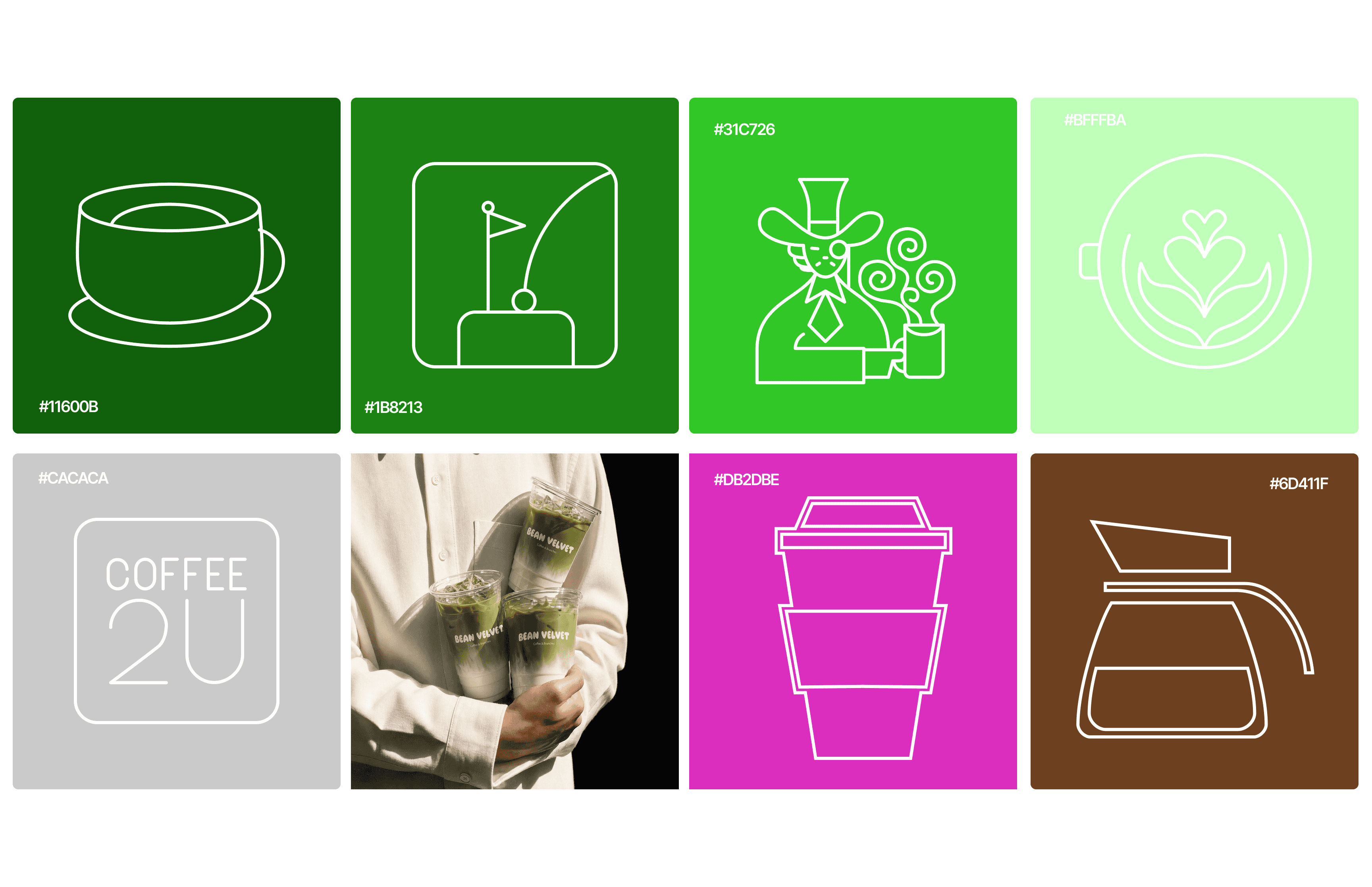
Deep forest green anchored by cream and white, with a hand-drawn illustration style that gives the brand its personality. The logo pairs a clean wordmark with a custom illustrated badge, and the brand character — a loose, friendly illustrated figure — appears across every touchpoint from the cup to the menu, giving Bean Velvet something most coffee brands don't have: a face you actually remember. Typography balances a confident display face for headers with something warmer and more casual for menu copy, because the whole identity is built to feel like a person made it, not a branding agency.
Deep forest green anchored by cream and white, with a hand-drawn illustration style that gives the brand its personality. The logo pairs a clean wordmark with a custom illustrated badge, and the brand character — a loose, friendly illustrated figure — appears across every touchpoint from the cup to the menu, giving Bean Velvet something most coffee brands don't have: a face you actually remember. Typography balances a confident display face for headers with something warmer and more casual for menu copy, because the whole identity is built to feel like a person made it, not a branding agency.


Featured work

Novrix
Designed and built a full agency portfolio in Framer, turning a bold dark brand into a fast, premium site.
Web Design
/
Framer Development
/
Web Design
Novrix
Designed and built a full agency portfolio in Framer, turning a bold dark brand into a fast, premium site.
Web Design
/
Framer Development
/
Web Design

Workwise
Designed the brand identity and dashboard UX for an employee tracking platform, from visual system to interface.
Brand Identity
/
Web Design
/
Dashboard UX
Workwise
Designed the brand identity and dashboard UX for an employee tracking platform, from visual system to interface.
Brand Identity
/
Web Design
/
Dashboard UX

Designed with love © All Rights reserved 2026
Designed with love © All Rights reserved 2026