A complete redesign of a team management dashboard — rebuilt with real UX thinking, a full brand identity, and five fully functional screens.
A complete redesign of a team management dashboard — rebuilt with real UX thinking, a full brand identity, and five fully functional screens.
Brand Identity
Brand Identity
/
/
Web Design
Web Design
/
/
Dashboard UX
Dashboard UX

WowWise started as a single screen. Good bones, strong visuals, broken logic. No task owners, disconnected data, navigation that led nowhere. This project is the story of taking that screen apart and rebuilding it as a real product — with an identity, a system, and five pages that each solve a specific problem for a team manager.
WowWise started as a single screen. Good bones, strong visuals, broken logic. No task owners, disconnected data, navigation that led nowhere. This project is the story of taking that screen apart and rebuilding it as a real product — with an identity, a system, and five pages that each solve a specific problem for a team manager.

Process
Process
The work covered the full stack of design: brand identity from zero, visual design system, information architecture, interaction design, and a coded interactive prototype.
The work covered the full stack of design: brand identity from zero, visual design system, information architecture, interaction design, and a coded interactive prototype.
The work covered the full stack of design: brand identity from zero, visual design system, information architecture, interaction design, and a coded interactive prototype.
UX Design
UX Design
Audited the original single-screen design, identified six structural UX failures, conducted user research with team managers, mapped user goals, and rebuilt the information architecture from the ground up. Every design decision was traced back to a real manager need.
Audited the original single-screen design, identified six structural UX failures, conducted user research with team managers, mapped user goals, and rebuilt the information architecture from the ground up. Every design decision was traced back to a real manager need.
Audited the original single-screen design, identified six structural UX failures, conducted user research with team managers, mapped user goals, and rebuilt the information architecture from the ground up. Every design decision was traced back to a real manager need.
UI Design
UI Design
Designed all five screens — Home, Departments, Org Chart, Tasks, and Profile — maintaining the warm, restrained visual language of the original while making every element earn its place on the screen.
Designed all five screens — Home, Departments, Org Chart, Tasks, and Profile — maintaining the warm, restrained visual language of the original while making every element earn its place on the screen.
Designed all five screens — Home, Departments, Org Chart, Tasks, and Profile — maintaining the warm, restrained visual language of the original while making every element earn its place on the screen.
The Problem It Solves
The Problem It Solves
Team managers need one place to answer three questions every morning: is anything wrong, who is working on what, and which team needs my attention. WowWise answers all three — calmly, quickly, without noise.
Team managers need one place to answer three questions every morning: is anything wrong, who is working on what, and which team needs my attention. WowWise answers all three — calmly, quickly, without noise.
Team managers need one place to answer three questions every morning: is anything wrong, who is working on what, and which team needs my attention. WowWise answers all three — calmly, quickly, without noise.

Home

Departements

Org shart

Tasks

My Profile


Brand identity
Brand identity
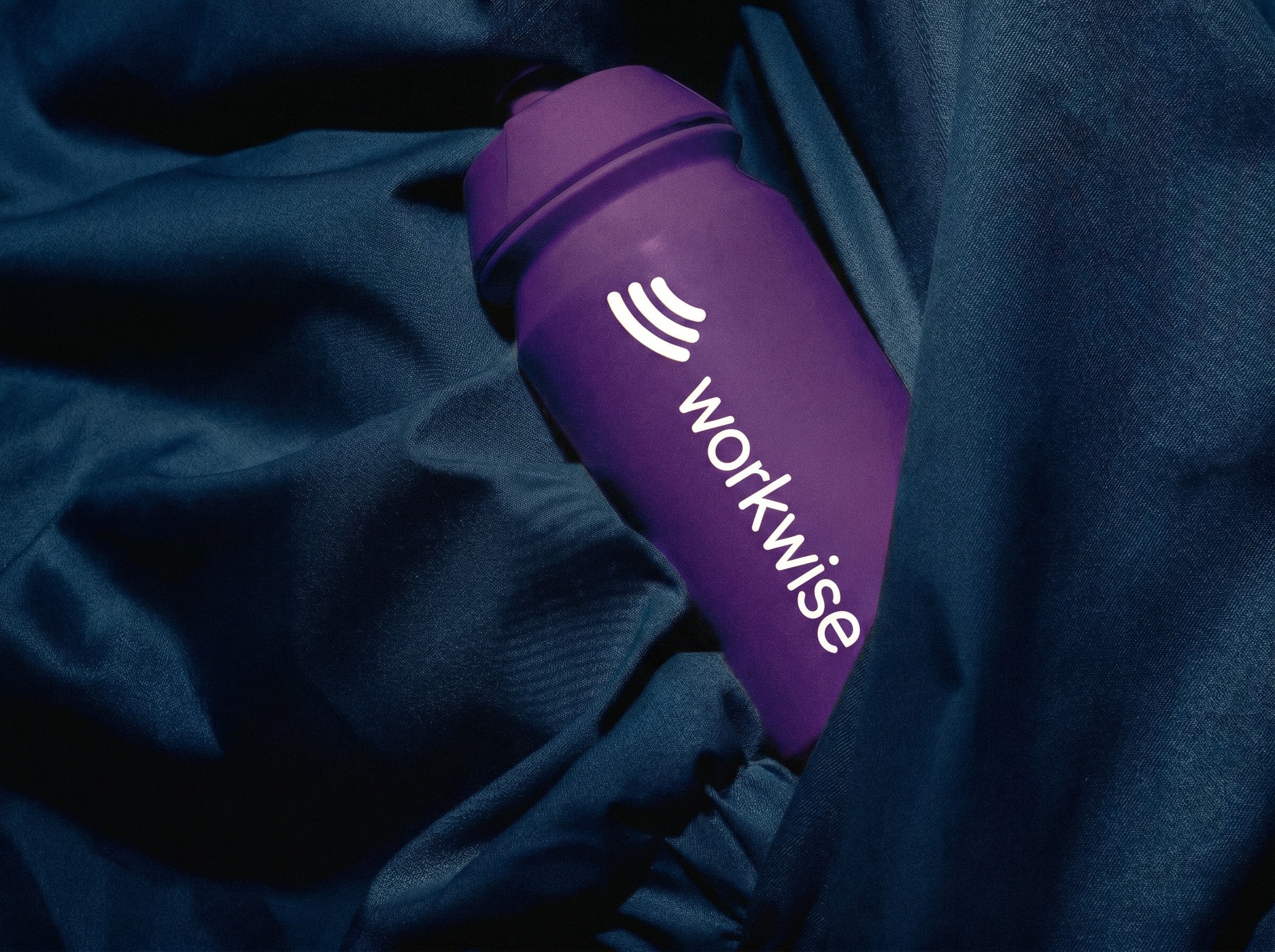
Designed the full WowWise identity from scratch — logo, color system, typography pairing, iconography style, and the overall visual language that carries across every screen. The palette is cream and ink with semantic color: blue for in progress, green for done, orange for warning, red for overdue.
Designed the full WowWise identity from scratch — logo, color system, typography pairing, iconography style, and the overall visual language that carries across every screen. The palette is cream and ink with semantic color: blue for in progress, green for done, orange for warning, red for overdue.






Featured work

Novrix
Designed and built a full agency portfolio in Framer, turning a bold dark brand into a fast, premium site.
Web Design
/
Framer Development
/
Web Design
Novrix
Designed and built a full agency portfolio in Framer, turning a bold dark brand into a fast, premium site.
Web Design
/
Framer Development
/
Web Design

Workwise
Designed the brand identity and dashboard UX for an employee tracking platform, from visual system to interface.
Brand Identity
/
Web Design
/
Dashboard UX
Workwise
Designed the brand identity and dashboard UX for an employee tracking platform, from visual system to interface.
Brand Identity
/
Web Design
/
Dashboard UX

Designed with love © All Rights reserved 2026
Designed with love © All Rights reserved 2026